top of page
Context
Internship
Role
Graphic Designer
Year
2018
The company where I did my internship in the first year of my Master's degree offers specific e-learning courses to learn languages, particularly English. This company began offering its training courses through illustrated books and nowadays needs to digitize everything. The fact is that when I arrived at this internship, I was surrounded by nothing but interns and alternates. After two months I was managing teams around six interns.
As interns come and go, some projects are not completed and are put on hold prioritize other subjects. One of these was Carnets de Voyage (Travel Diaires), which was assigned to me.
The aim was to reshape the pages to obtain a visual harmony and a regular, coherent dynamism throughout the page. The content, the exercises, the page presentation system with scrolling text banners with parallax effects, and the characters all had to remain the same.


When I started, I had these four characters (on the right) and this base (below). You have to imagine the banners of text scrolling at a different speed to the background.

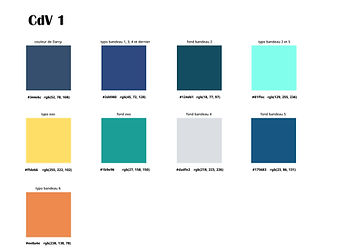
The images were quite dark, the photographic joints were not hidden by text banners, the main character was not sufficiently represented and there was no real graphic bias. My first instinct was to find a graphic identification for each of the journals and characters and what better way to create visual harmony than with color ?


For Darcy's character, it is a dominant blue. Another important point: to differentiate the interactive parts from the narrative parts, the text banners are transparent with an external shadow for what belongs to the story and opaque with an internal shadow for the exercise parts.

The "Carnets de Voyage" were set up to share London's English-speaking culture, so I have taken the initiative of carrying out photographic research and modifying or adding to some of the carnets to explore the subject further. Consequently, I have tried to leave enough space to appreciate the photos, as they must be shared with the text banners and characters.


Before
After


These carnets are aimed at a beginner audience, so the text is written in French and punctuated with English expressions and their translations. Integrated into a storytelling context, it is easier for the learner to assimilate this vocabulary. The idea, therefore, was to make these words stand out through the boldness of the font and the color.


Before
After

The characters are deliberately stereotyped to present profiles familiar from English-speaking culture, but also to match the elitist image characteristic of the company's charter.


When I started working on the characters, I did not realize at first that the Pippa character had two versions. It was only afterwards that I realized that the image I had was not the latest version (see character overview at the top of the page), and that I needed to update it by editing the photo with the right face. As there was no one to tell me the history of the project, this character was almost incoherent in the carnets.


Before
After


With the team I guided, we each moved forward in our carnet, with me doing the rereading and systematic corrections. Then I also worked with the development team to get the integration right, where I also did a lot of proofreading.


bottom of page


